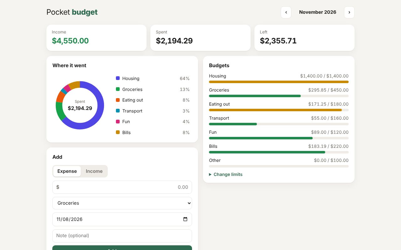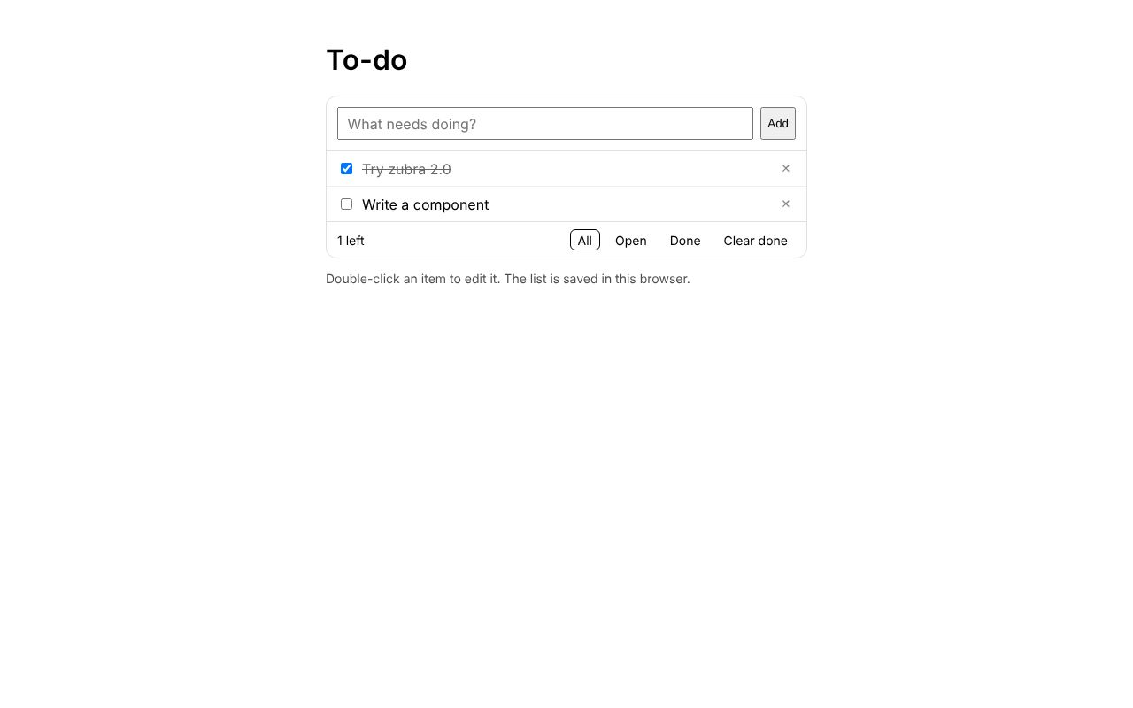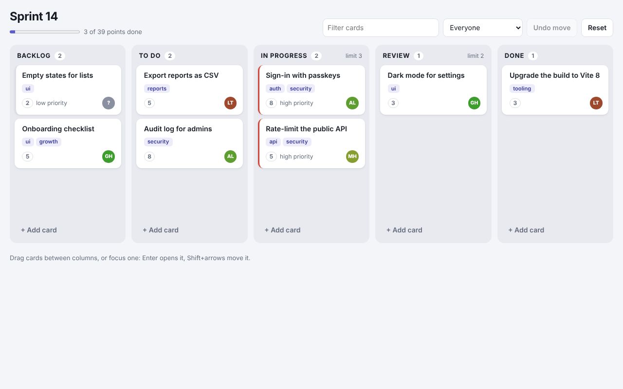
React 19
Sprint board
.zb files imported as React components, React children in their slots, drag and drop, and a column from a component library.
A compiler for web components
A Zubra file is a script, some styles and a template. The compiler turns it into a standard custom element, the HTML a server sends, and typings. The element works in plain HTML, in React, Vue, Svelte and the rest, and on the server. Nothing is hidden: you can read every line it writes.
npm create zubra@latest
<script>
  let copied = false  // state: assigning it updates the DOM

  async function copy() {
    await navigator.clipboard.writeText(text)  // `text` is a prop, by name
    copied = true
    setTimeout(() => (copied = false), 1500)
  }
</script>
<style>
  button.done { color: green; }  /* scoped to this component, in light DOM */
</style>
<copy-button text label="Copy">  <!-- the host tag: the element and its props -->
  <button type="button" onclick={copy} class:done={copied}>
    {copied ? "Copied!" : label}
  </button>
</copy-button>That one file compiles to the three things below. This page ran the compiler to produce them, so they are what zubra compile writes today.
zubra compile copy-button.zb --props props.json
<copy-button text="npm create zubra">
  <button type="button">
    Copy
  </button>
</copy-button>
Content on the page before any JavaScript runs. When the script loads, the element binds to this markup in place.
zubra compile copy-button.zb --emit js
// Generated by zubra from copy-button.zb. Do not edit.
import { $define, $r, $t } from "@zubra/runtime";
import { state as __zubraState, computed as __zubraComputed } from "@zubra/runtime";

export const tag = "copy-button";

export default $define(tag, {
  props: {
    "text": { attribute: "text", default: undefined, required: true },
    "label": { attribute: "label", default: "Copy", required: false },
  },
  abi: 3,
  shadow: false,
  form: false,
  slots: [],
  events: [],
  styled: true,
  styles: "@layer theme, base, components, utilities;\n@layer components {\n@scope (copy-button) to ([data-zb-slotted=\"copy-button\"]) {\n  button.done { color: green; }                    /* scoped to this component, in light DOM */\n}\n}\n",
  template: "                    \n  <button type=\"button\"></button>\n",
  setup($p, $emit) {
function __zubraAssign(signal, value) { signal.set(value); return value }
function __zubraUpdate(signal, delta, prefix) { const old = signal.get(); signal.set(old + delta); return prefix ? old + delta : old }
  const copied = __zubraState(false)                               // state: assigning it updates the DOM

  async function copy() {
    await navigator.clipboard.writeText($p.text)      // `text` is a prop, by name
    __zubraAssign(copied, true)
    setTimeout(() => (__zubraAssign(copied, false)), 1500)
  }
    return [
      { path: [0], on: "click", handler: () => $r(copy) },
      { path: [0], toggle: "done", value: () => $r(copied) },
      { path: [0], text: () => "\n    " + $t(($r(copied) ? "Copied!" : $p.label)) + "\n  " },
    ];
  },
});
A description, not a class. One shared definition in the runtime turns it into a custom element.
zubra compile copy-button.zb --emit dts
// Generated by zubra from copy-button.zb. Do not edit.

export declare class CopyButton extends HTMLElement {
  /** Attribute `text`. Required. */
  text: unknown;
  /** Attribute `label`. Default: `"Copy"`. */
  label: string;
  /** Resolves once pending prop changes have reached the DOM. */
  readonly updateComplete: Promise<void>;
}

/** The props of `<copy-button>`, for frameworks and wrappers. */
export interface CopyButtonProps {
  text: unknown;
  label?: string;
}

export declare const tag: "copy-button";
export default CopyButton;

declare global {
  interface HTMLElementTagNameMap {
    "copy-button": CopyButton;
  }
}
The element’s properties, events and form-control API, for the editor and for the same file imported into React or Vue.
Read one component’s output, rule by rule: why custom elements are awkward by hand, and where each rule shows up in the output.
This is the same component as a hand-written custom element. It needs shadow DOM to scope one style rule, has no server HTML, and has the two bugs most hand-written elements have: a forgotten #render() and a listener removed with a different reference.
43 lines by hand
const template = document.createElement("template");
template.innerHTML = `<style>button.done { color: green; }</style><button type="button"></button>`;

class CopyButton extends HTMLElement {
  static observedAttributes = ["text", "label"];
  #copied = false;
  #timer = null;
  #button;
  #onClick = () => this.copy();              // a stored reference, so removeEventListener works

  constructor() {
    super();
    this.attachShadow({ mode: "open" }).append(template.content.cloneNode(true));
    this.#button = this.shadowRoot.querySelector("button");
  }
  get text() { return this.getAttribute("text") ?? ""; }
  set text(v) { this.setAttribute("text", v); }
  get label() { return this.getAttribute("label") ?? "Copy"; }
  set label(v) { this.setAttribute("label", v); }

  connectedCallback() {
    this.#button.addEventListener("click", this.#onClick);
    this.#render();
  }
  disconnectedCallback() {
    this.#button.removeEventListener("click", this.#onClick);
    clearTimeout(this.#timer);
  }
  attributeChangedCallback() { this.#render(); }

  async copy() {
    await navigator.clipboard.writeText(this.text);
    this.#copied = true;
    this.#render();                           // every state change has to remember this
    clearTimeout(this.#timer);
    this.#timer = setTimeout(() => { this.#copied = false; this.#render(); }, 1500);
  }
  #render() {
    this.#button.textContent = this.#copied ? "Copied!" : this.label;
    this.#button.classList.toggle("done", this.#copied);
  }
}
customElements.define("copy-button", CopyButton);
17 lines with Zubra
<script>
  let copied = false  // state: assigning it updates the DOM

  async function copy() {
    await navigator.clipboard.writeText(text)  // `text` is a prop, by name
    copied = true
    setTimeout(() => (copied = false), 1500)
  }
</script>
<style>
  button.done { color: green; }  /* scoped to this component, in light DOM */
</style>
<copy-button text label="Copy">  <!-- the host tag: the element and its props -->
  <button type="button" onclick={copy} class:done={copied}>
    {copied ? "Copied!" : label}
  </button>
</copy-button>It is a custom element, so anything that renders HTML can use it.
<copy-button text="npm create zubra"></copy-button><CopyButton text="npm create zubra" />Through @zubra/unplugin: the same file, typed.
zubra compile copy-button.zb --props props.jsonOr @zubra/server for Express, Fastify, Hono and Eleventy.
Who Zubra is for, and what does and doesn’t cross the boundary into a framework.
npm create zubra@latest my-appPick a framework, or none. You get a working app with one component, a dev server that updates components in place, and a browser test..zb files, the compiler's errors as you type, and completion and hover for your components. Other editors work through the language server.Every framework, server and kind of client, each tested in a browser on every change. The ones marked “needs a server” run locally: each one’s README has the commands.
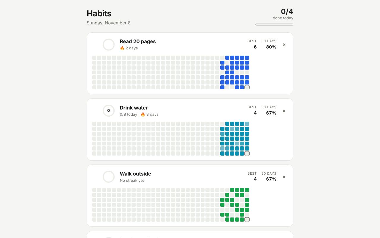
React 19
.zb files imported as React components, React children in their slots, drag and drop, and a column from a component library.
Vue 3
v-model on Zubra elements, slot content from Vue templates, and an SVG donut from Vue’s computed state.
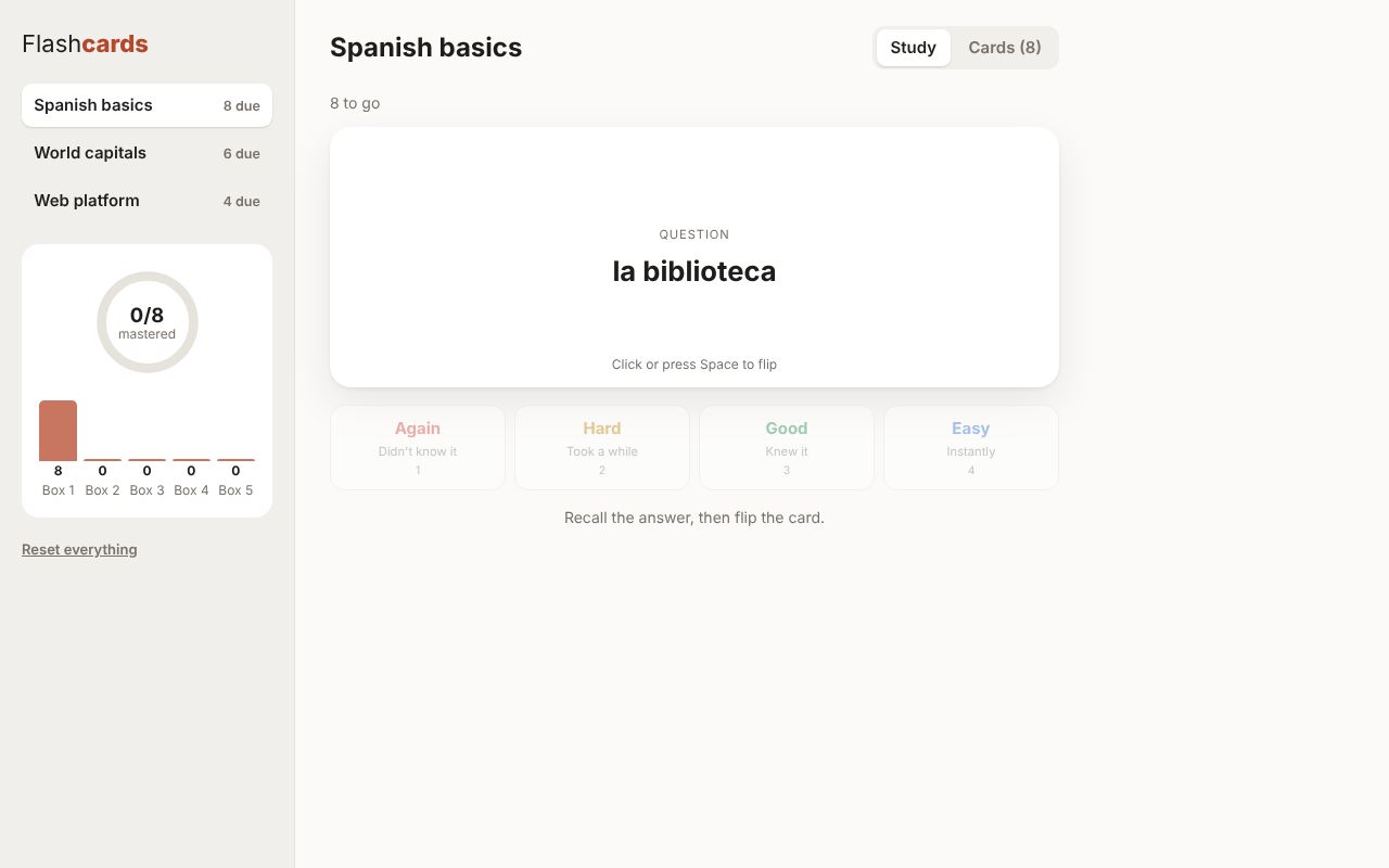
Svelte 5
A spaced-repetition trainer: a shadow-DOM element with named slots filled from Svelte markup, and keyboard shortcuts.
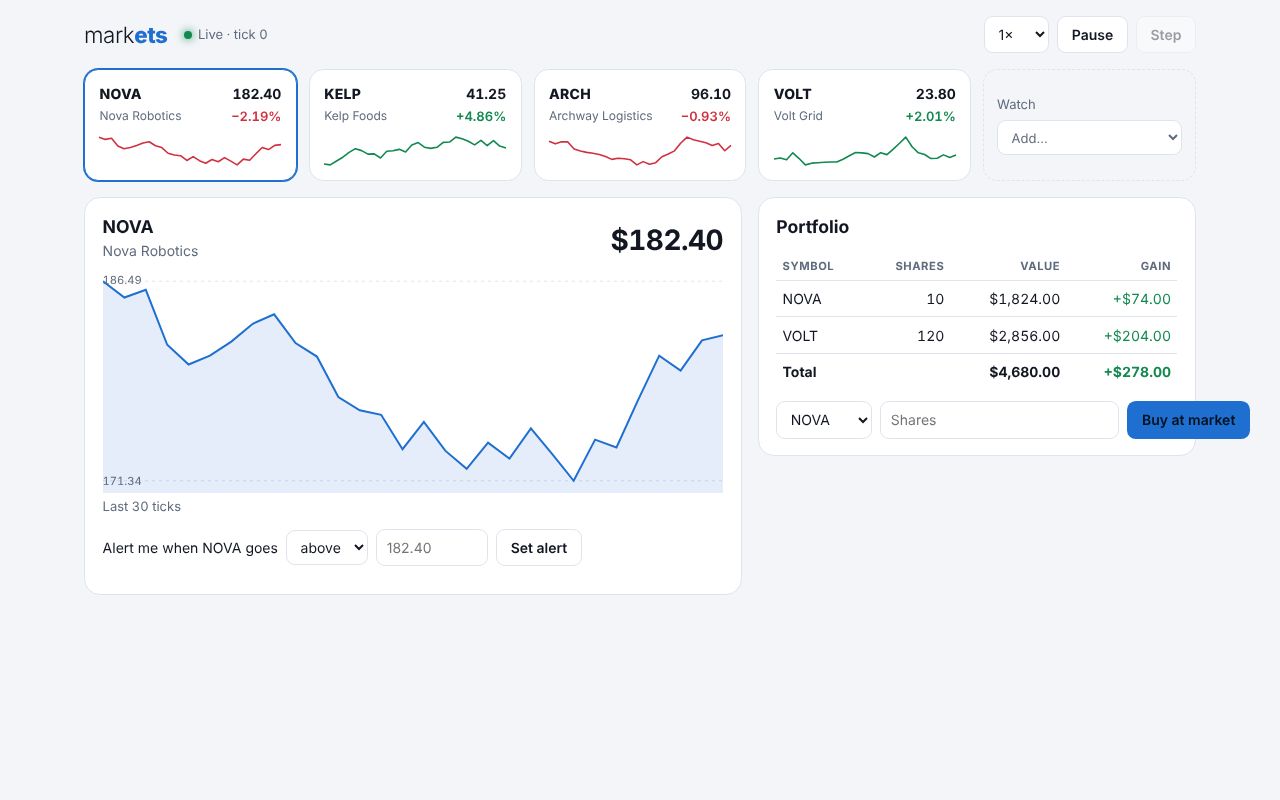
Solid
Live prices on every tick through prop: bindings, nested elements, and an SVG chart with pointer events.
Lit 3
Light-DOM Zubra elements inside a LitElement’s shadow root, with the user from @lit/context.
Preact 10
Objects as props, a contribution-style grid with keyboard navigation, and a Zubra form control in a Preact form.
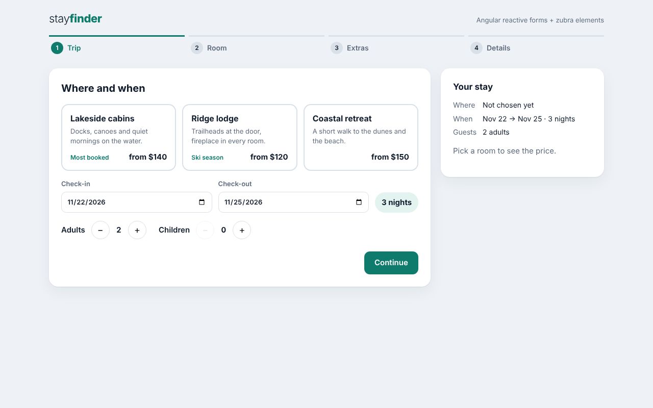
Angular 22
Reactive forms whose controls are Zubra elements, with validation and a step indicator.
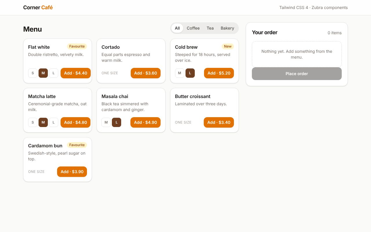
Tailwind CSS 4
Tailwind utilities in .zb templates, and the same CSS in a shadow-DOM component through adoptStyles().
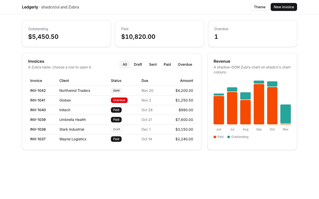
React + shadcn/ui (Radix)
Zubra components on shadcn’s theme next to its Dialog and DropdownMenu, restyled together by the theme menu.
React + MUI
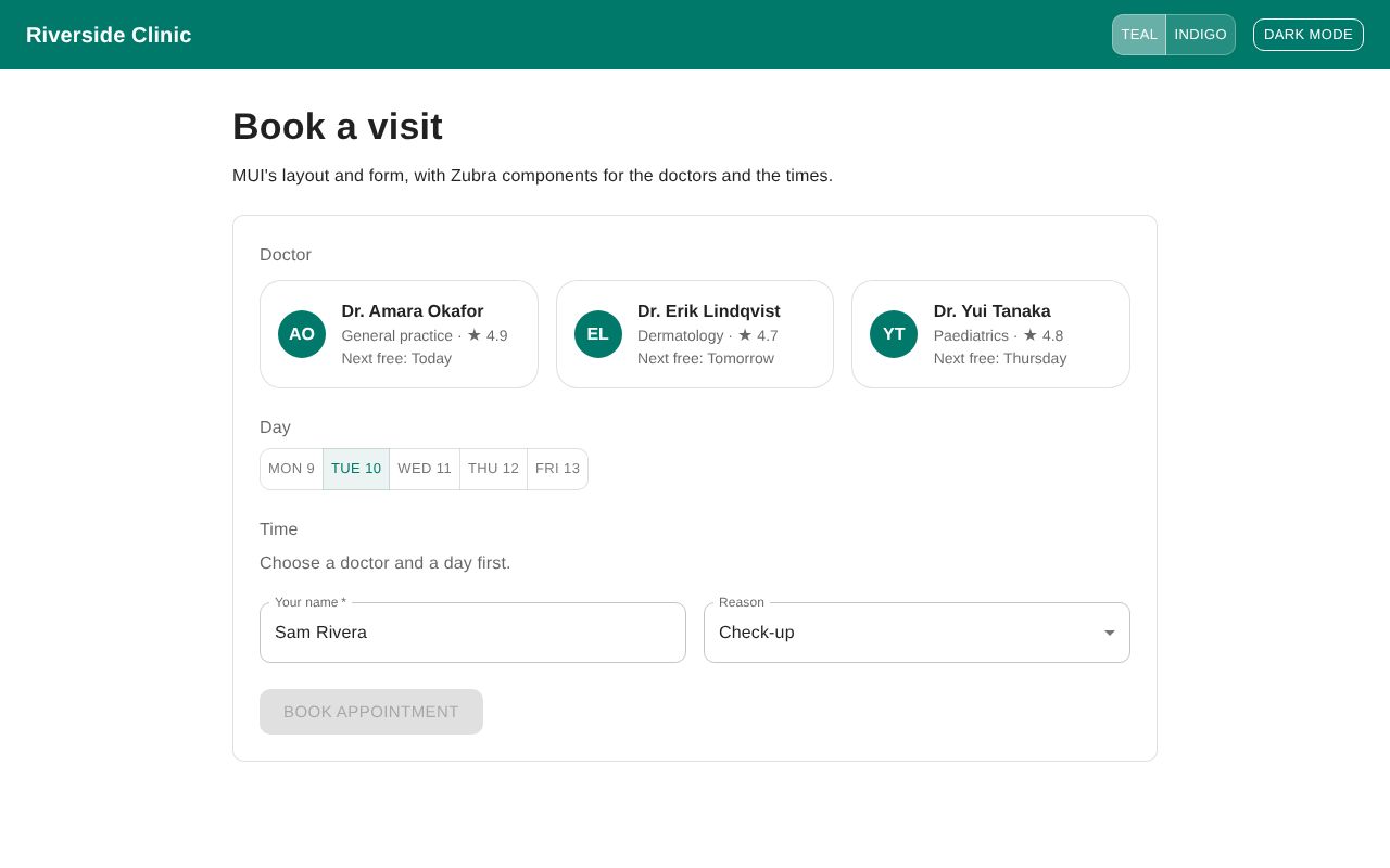
MUI’s theme reaching Zubra components as CSS variables, with a Zubra time picker in MUI’s form.
Bootstrap 5 + Sass
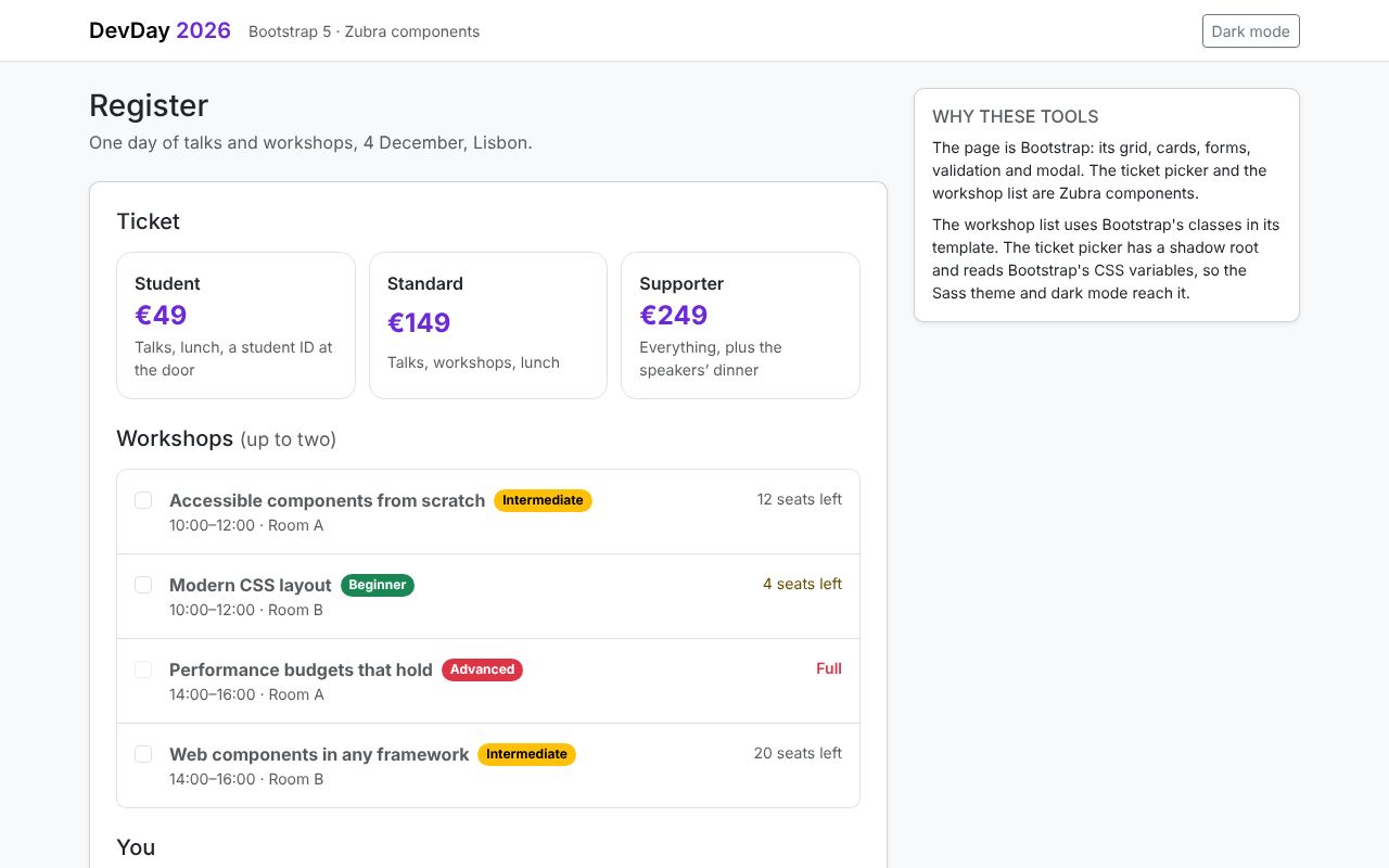
Bootstrap’s classes in a component, its Sass theme in a shadow root, and its validation with a Zubra form control.
Astro
Zubra components as Astro islands, rendered at build time and hydrated where they’re interactive.
Eleventy 3
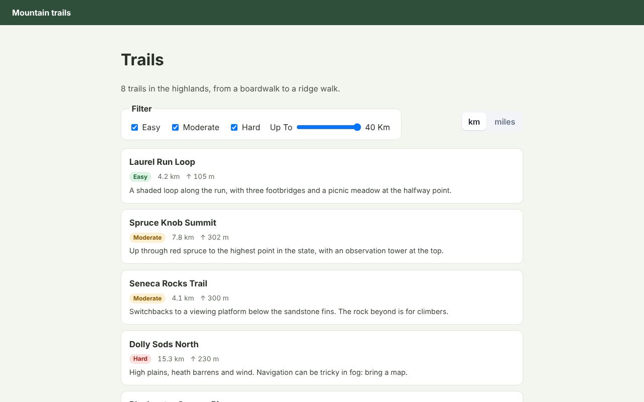
A static trail guide rendered by @zubra/server at build time, with no bundler.
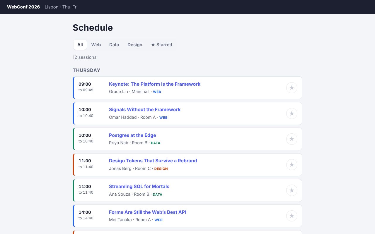
Next.js 16
Filter and star talks, and rate one through a Server Action.
Needs a server: run it locally Source
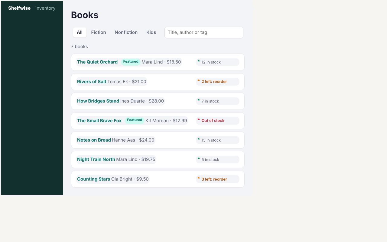
Nuxt 4
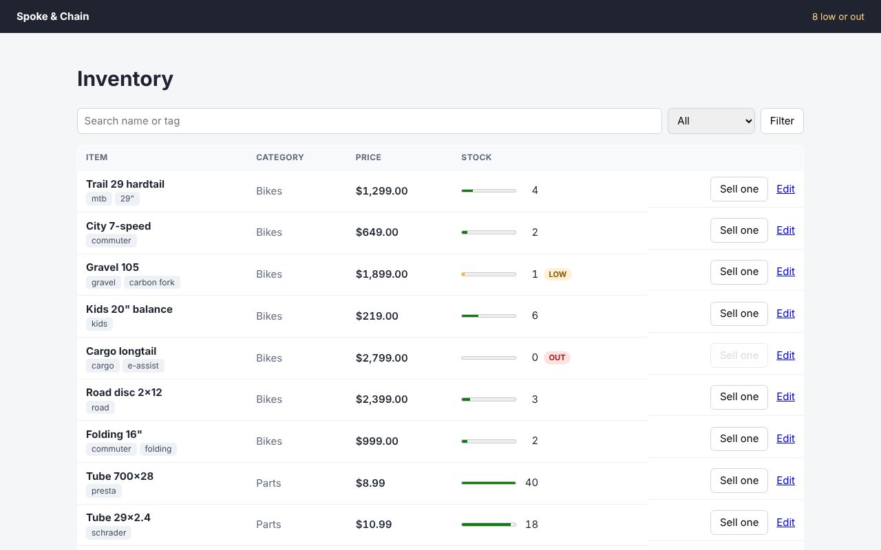
Books filtered on the server with the URL in sync, stock against reorder points, and an edit form.
Needs a server: run it locally Source
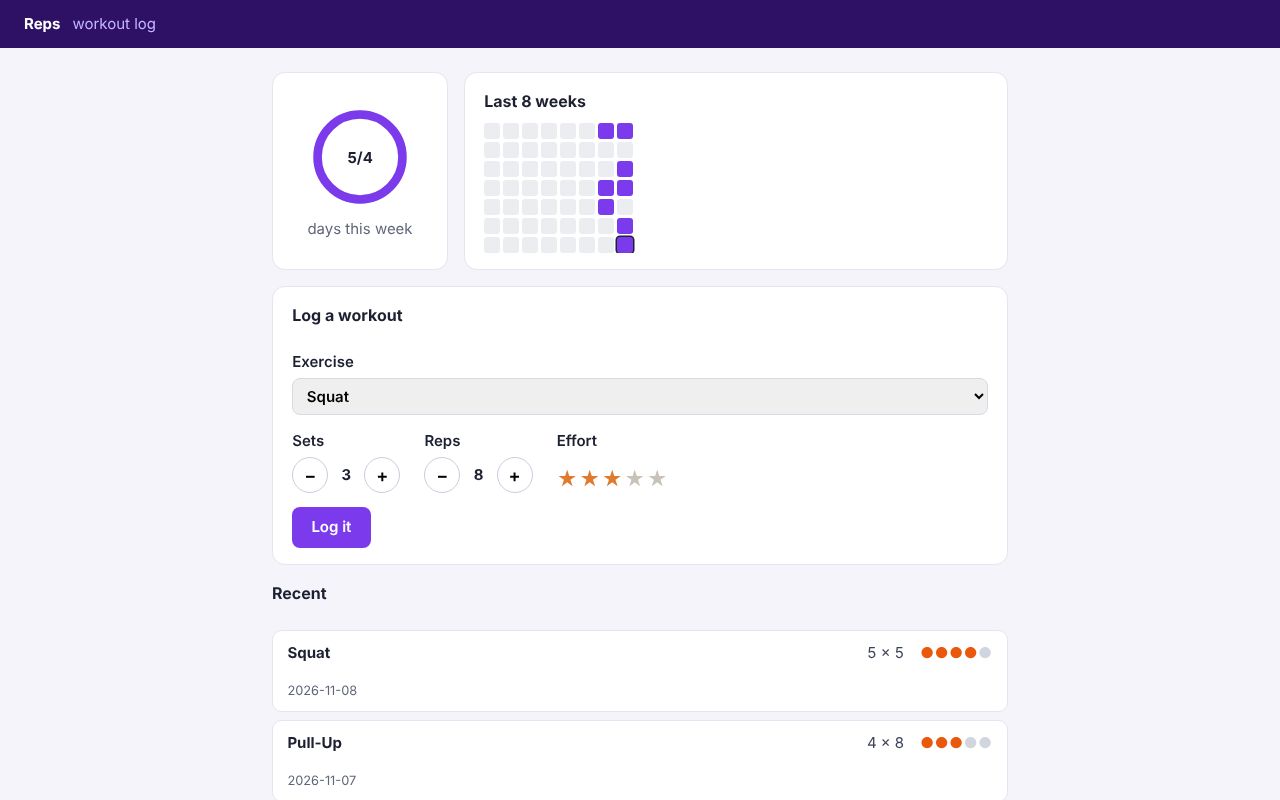
SvelteKit 3
Exercises logged through a form action with use:enhance, and a week of training against a goal.
Needs a server: run it locally Source
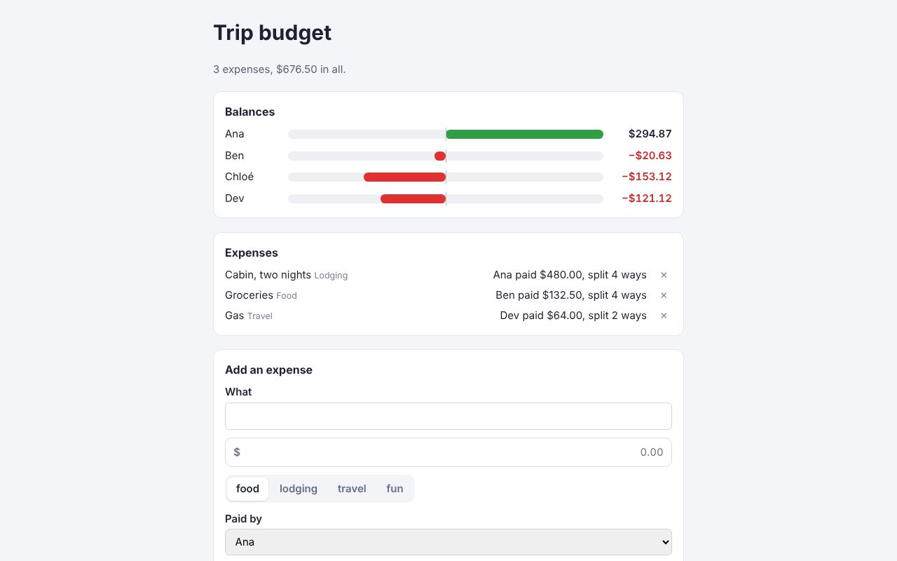
React Router 8
Who paid for what and who owes whom, in framework mode with loaders and actions.
Needs a server: run it locally Source
SolidStart 2
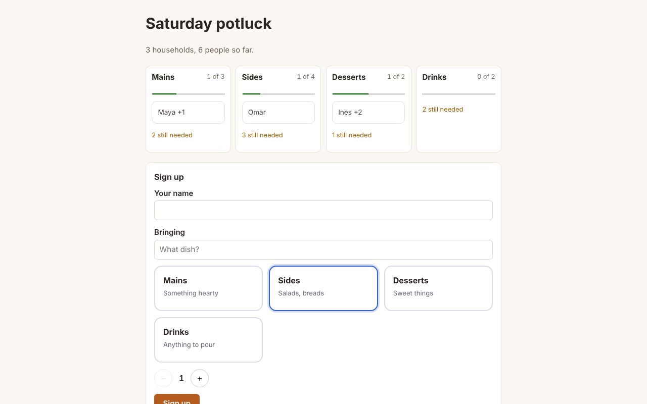
Who’s bringing what, with a sign-up form that works without JavaScript.
Needs a server: run it locally Source
Flask, Jinja, SQLite
Components rendered by the Rust CLI, with no Node.js on the server.
Needs a server: run it locally Source
Vite, no framework
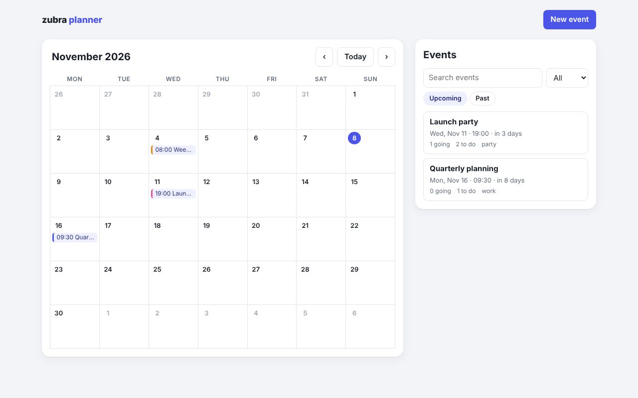
A single-page app written only in .zb components: a month calendar, an event dialog, and each event planned in tabs (schedule, guests, budget).
Electron
A desktop app under a strict content security policy.
Needs a server: run it locally Source
Chrome extension (MV3)
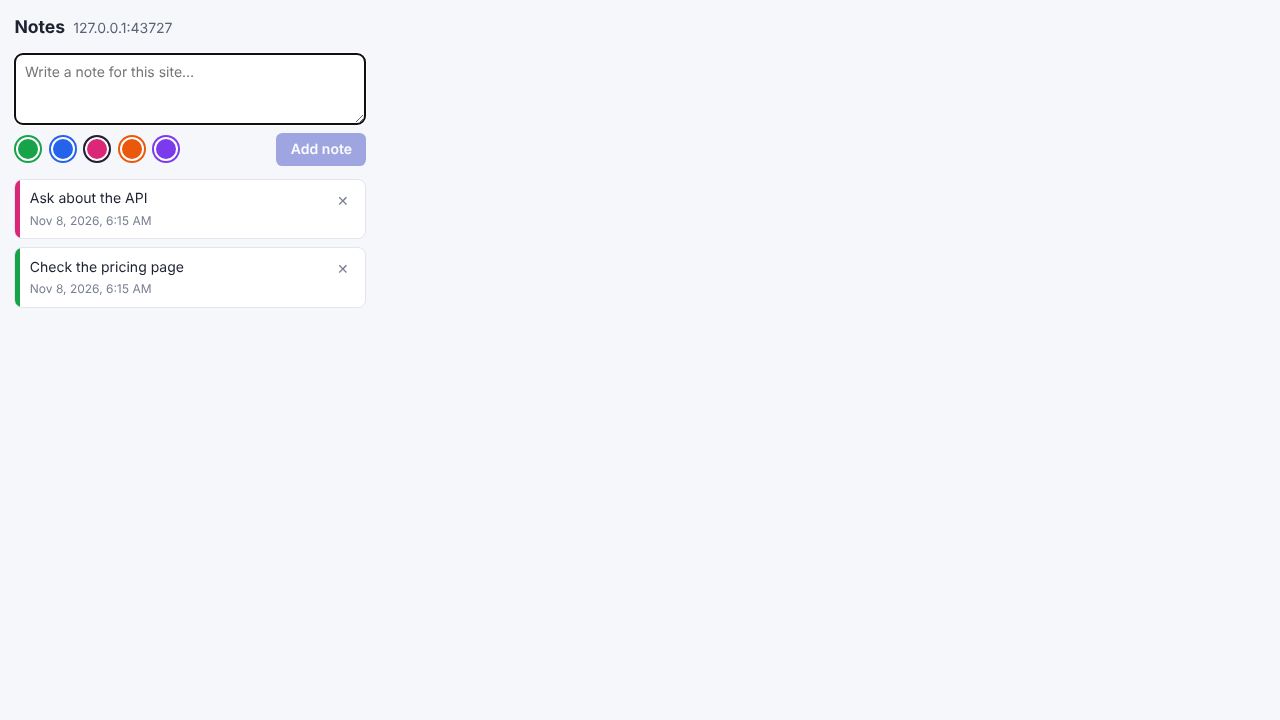
Notes for each site, in a popup, a side panel and the page itself.
Needs a server: run it locally Source